ACCELERATION
People’s Perception of Time
Everyone whom I have asked, including young people, feels like time is speeding up, like the day, the week, the year starts, and “before you know it,”, it’s gone. People feel like they have little time to carry out their plans. I would guess that this not universal, but perhaps it is.
Technology
And everyone, or certainly close to it, is aware of Moore’s Law, that the number of transistors that can fit on a chip doubles every two years. And Intel’s David House added that processor performance would double every 18 months. This acceleration in performance, and the fact that the price for that performance has steadily dropped, has changed the world in magnificent ways that have been difficult to envision at any point in time. People like Ray Kurzweil are famous for utilizing this increasing performance and for having made some prescient estimates of the impact of this exponential increase in price/performance, though some of his predictions have been wide of the mark, and it seems his general view that processors will outdistance human intelligence is destined to fail as well since a pathway to program a machine to have a higher self, intuition, noble emotions, will, self-awareness, and a sense of humor seems unavailable, to put it mildly.
Exponential, parabolic trends
As we did with the weather and Earth changes, let’s look at some data.
Money
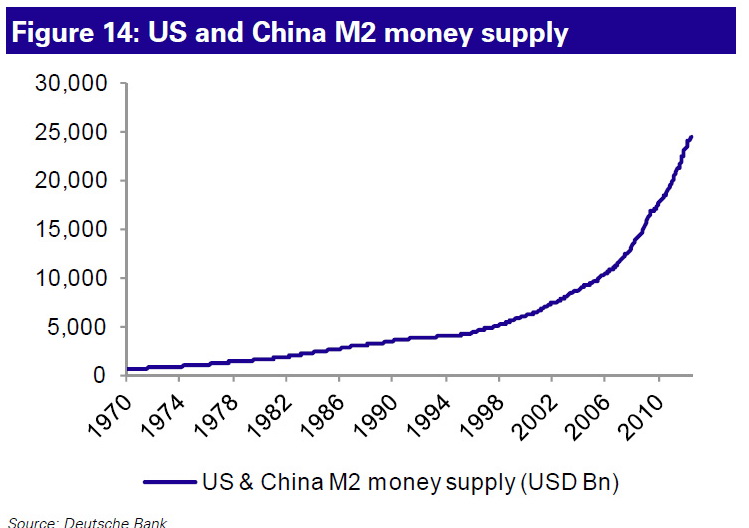
It took the USA until 1990, that is, over 200 years, to create the first trillion US dollars. The rate of money growth had increased so much by 2007 that it took less than a year to create each additional trillion. Now, it’s seemingly all in day’s (OK, maybe a month’s) work. Here’s a chart of the money supply in the US and China combined:

Yep, between the US and China, that’s $25 trillion floating around.
Another way to look at things is this: From 1971 to 2007, the world economy grew fourfold. Over the same period, the amount of money floating around increased forty-fold. And central banks were just leaving the proverbial starting gate in 2007; the continuing financial crisis had just begun, and the response was, and continues to be: Print Money!
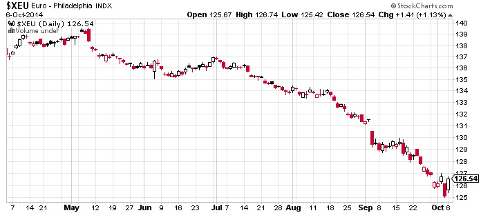
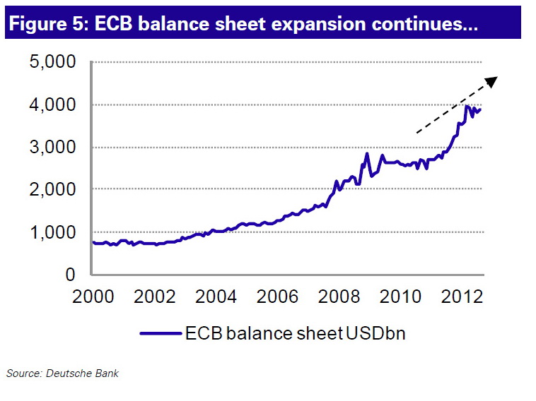
And don’t think the Europeans want the euro to be left out of this print-a-thon:

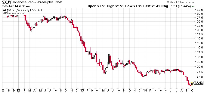
And the Japanese just joined the US and the Eurozone saying they would print “whatever it takes” to get their economy humming again.
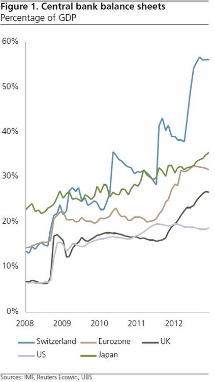
And the Swiss!?!? The most pronounced money printing line on this chart (in light blue) represents Switzerland, purported to be so conservative about money. Ah, the good old days! No longer. For the size of their economy, they are the current money-printing front-runner by a wide margin:

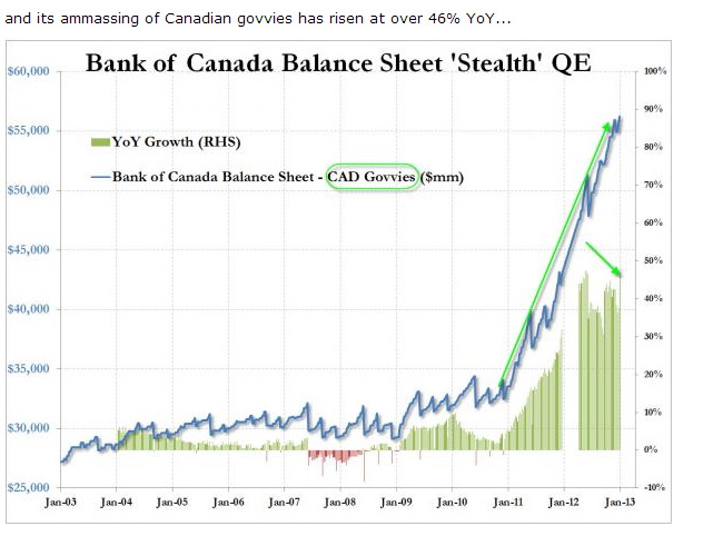
Et tu, Canada? (from zerohedge.com)

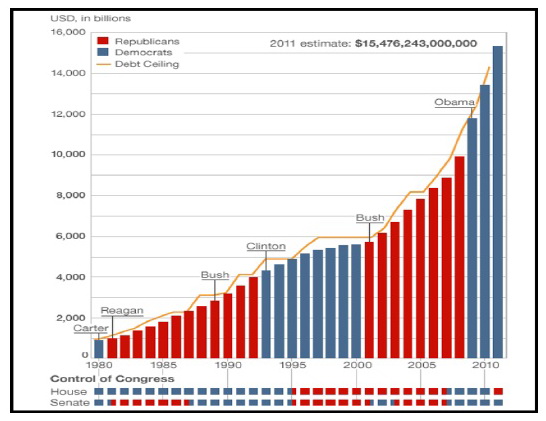
And this has little to do with political parties, as shown on this chart of federal government debt in the US:

though I would ask that you note the super-acceleration of this trend that started in the year 2000.
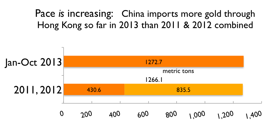
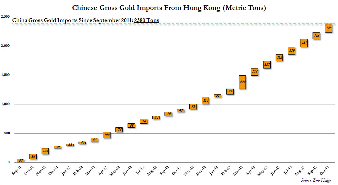
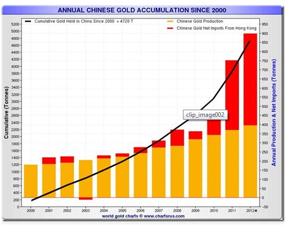
And in today’s world, the Chinese are the ones doing the heavy lifting in terms of manufacturing, so they are collecting a lot of this printed paper money, in other words, the West prints paper, sends it to China, and gets real goods in return. But the Chinese aren’t stupid, they are well aware of how much more of this paper is being created. So what’s their solution? To get real:

The Chinese mine more gold than any other country now—none of which leaves the country–and they import even more physical gold from other countries. Insiders at the London Bullion Market Association, the leading venue in the world for trading physical gold, say that the Chinese are vacuuming out the London gold warehouses. And the Chinese are scouring the planet to buy mines, wells, and so forth, especially in Africa
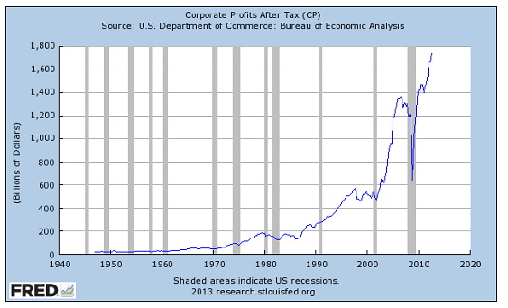
But really, one would think that, with all this money floating around—there must be at least 200 times the money around now versus 1971–everyone must be rich! But we know that’s hardly the case. Sure, there are other parabolic charts, like the one for corporate profits:

The corporations seem to be doing quite well. And US banks had profits of $35 billion in the fourth quarter of 2012 alone. (Yes, the same banks that needed those big bailouts. As a group, they had a total of four quarters where they weren’t profitable. It’s been business as usual ever since. And they are hard at work telling legislators, as they bribe them, that any new regulations will seriously hurt their business.)
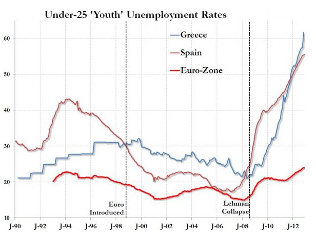
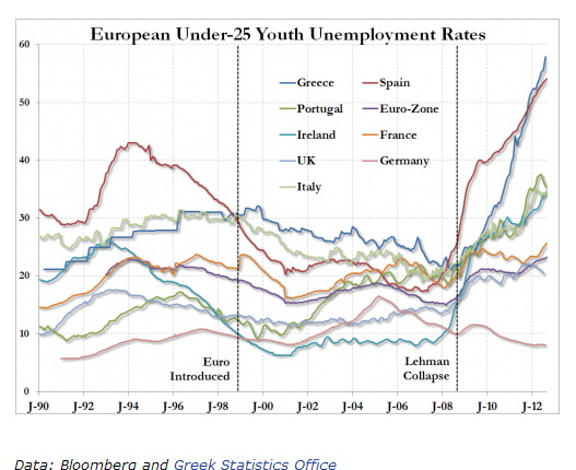
But other parabolic charts tell a different story. Here’s one for youth unemployment in the Eurozone (from zerohedge.com):

Yes, that’s over 60% youth unemployment in Greece, with Spain right behind.
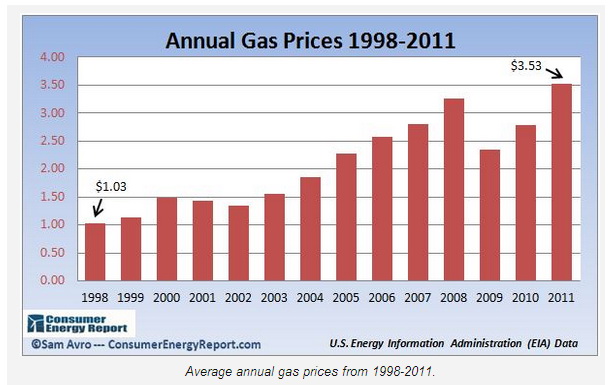
And gasoline prices are “doing great”—for the oil companies, that is. Here’s the price chart for the US, with gas up 243% since 1998:

That chart is only through 2011, but since US gas prices just registered their highest ever price for a February here in 2013, this trend does not seem to be in jeopardy.
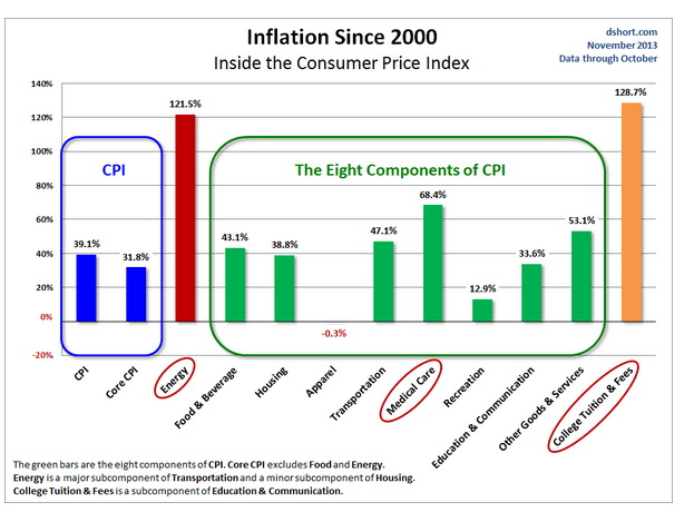
And the Food Price Index of the UN Food and Agriculture Organization is up 132% since the year 2000, with the all-important cereals/grains index up 190%. This is putting an extreme and accelerating squeeze on the budgets of the poor around the world.
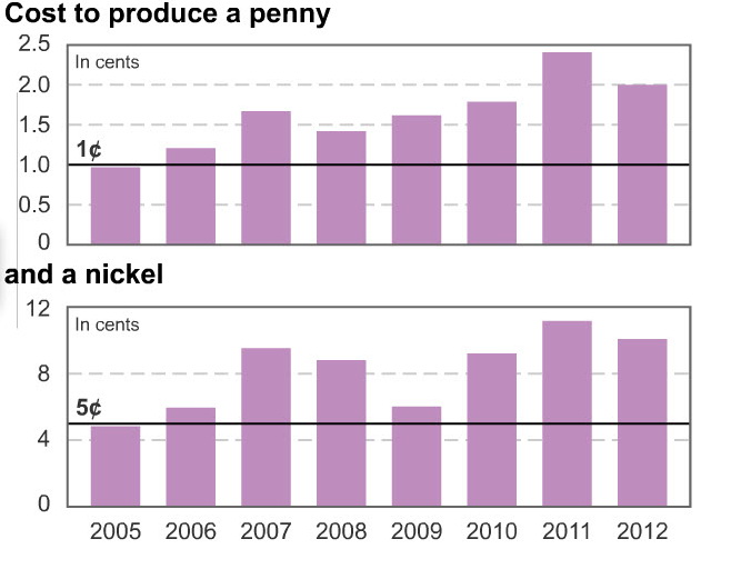
This article contains the chart below showing that in 2005, it cost the US government one penny to mint a penny and one nickel to mint a nickel. Now, after all that money printing, it costs twice as much:

resulting in a loss of $436 million for the Government of the US (GUS) to mint pennies and nickels since 2006.
So it seems clear that the accelerating money printing is accelerating the cost of real things that people need: gasoline, food, the metals that go into manufactured products, and so forth.
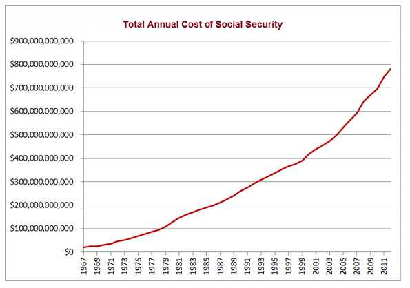
Here’s the accelerating cost of Social Security in the US:

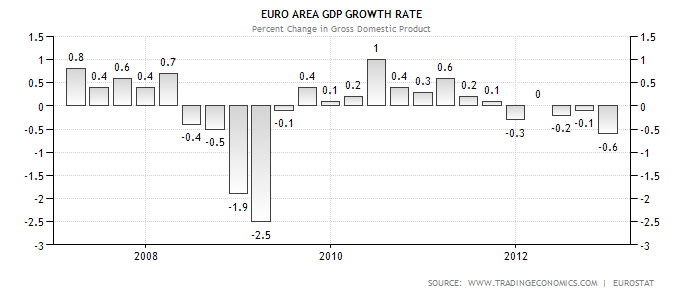
Well, we saw the accelerating youth unemployment in the Eurozone above. And the EU just announced that its overall unemployment rate is 12%. And, as this chart shows, there hasn’t been any growth in the EU economy since late 2011 (chart source):

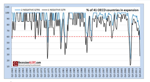
In the US, GUS says the economy hit stall speed (0% “growth”) in the Fourth Quarter 2012. Here is a chart that shows that, of the 41 largest national economies in the world, only 18% of them expanded in the Fourth Quarter of 2012:

Astute chart readers will notice that such a reading corresponds with the worst recessions (1973-74, 1981-82, and 2008-2009) of the last 50 years, so now you know why the central banks have started printing even more money–yes, accelerating!
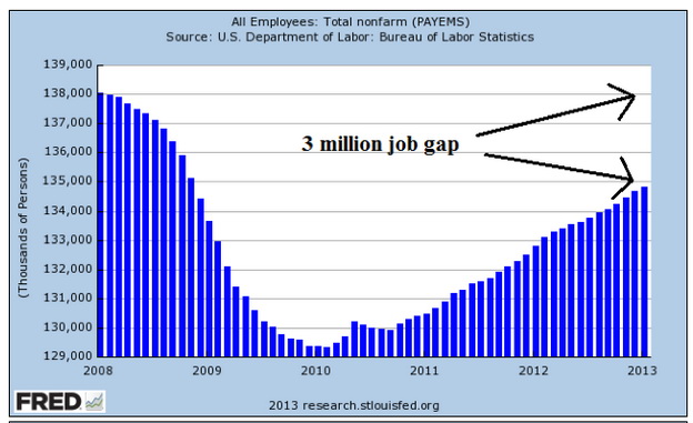
How is it going for jobs in the US? As this chart shows, the US is still 3 million jobs short of where things were in 2008:

Even worse, as the next chart shows, the large increase in the number of people working part-time means that a lot of the apparent job gains shown on the previous chart are part-time rather than full-time jobs:

If you think it’s only uneducated people who are suffering from all this, check this:
Number Of PhD Recipients Using Food Stamps Surged During Recession
The number of PhD recipients on food stamps and other forms of welfare more than tripled between 2007 and 2010 to 33,655, according to an Urban Institute analysis cited by the Chronicle of Higher Education. The number of master’s degree holders on food stamps and other forms of welfare nearly tripled during that same time period to 293,029, according to the same analysis.
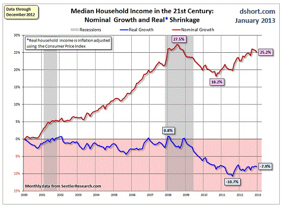
These job difficulties are reflected in household income in the US. The following chart shows two problems. While the red line shows income growth since 2000, it is still lower than it was at the start of the financial collapse in 2007. And the blue line shows household income adjusted for inflation. When GUS-calculated inflation is taken into account, income for the average household is 8% lower than it was 13 years ago:

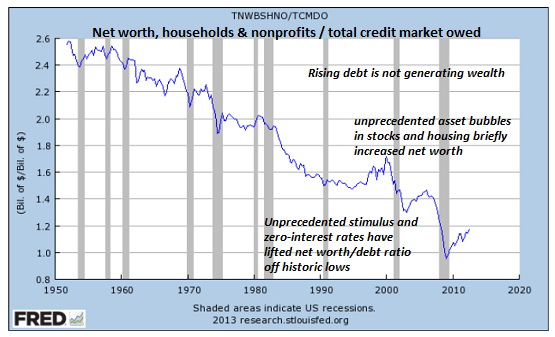
Here is a chart of US household net worth (annotated by Of Two Minds) compared to all of the debt that has been created, showing that all of that debt is not making people richer:

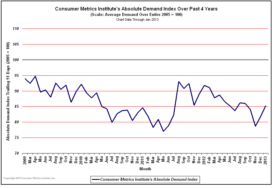
All of these economic charts were compiled by governments who, as we’ll show in a future post on the acceleration in lying, have a strong vested interest (it’s literally and even proudly called MOPE by academics—Management of Perception Economics) in making things look better than they are. In that light, I ask that you consider the following two charts compiled by a private bunch of computer geek types at a place called Consumer Metrics Institute. They thought, in this time of highly-networked business, that it was silly to have to wait until governments spent months collecting data before telling us what happened some months back, that the data could be collected and reported in near-real-time. If you wish, you can find out what they do at their FAQ.
But what they essentially do is track, in real time, discretionary purchases for things like automobiles, housing, vacations, durable household goods and investments.
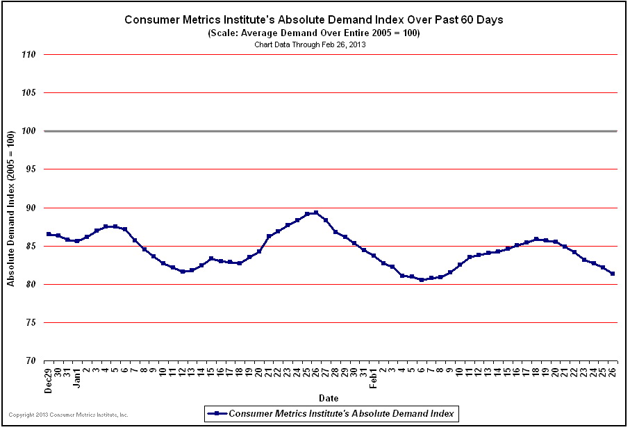
These two charts show the trend in these purchases where a value of 100 would equal the same level of purchasing as was taking place in 2005. The first chart is the last 60 days:

And the second chart is of the last three years:

So, both charts show their index hovering around 85 or lower, which means that this large portion of the US consumer economy is 15% smaller than it was in 2005! Perhaps that aligns better with the income and net worth charts shown above rather than the rosy “we’re in a wonderful economic recovery” MOPE spewed by minions of The Powers That Be.
So what it looks like is that all that money printing is making a select few richer and, by driving up the prices of real goods, squeezing regular people—whose income is falling and who spend a far greater percent of their income on real goods. And the Western central banks say it isn’t their fault that people are rioting in countries where people’s costs for food have gone from 40% to 80% of their income. Nope, they aren’t driving prices up at all with their money printing, it’s those “evil speculators.” Well, perhaps it is evil speculators, but they are aided and abetted by a vast surplus of gambling chips supplied by the central banks.
There’s more to come. Stay tuned for Part 6.


