What is the Transition? Part 3

Sea Level Rise

Have you ever seen a film of a three mile by one mile chunk of glacier falling into the sea? If not, and if you have four minutes to spare, now you can, by clicking on this link for an excerpt from the film Chasing Ice, which concludes, by the way, with a classic example of acceleration.

It helps to see films like that since the noise in the media on sea level rise is nearly deafening. A $120 million war chest can be used to make a lot of noise:

     Secret funding helped build vast network of climate denial thinktanks

Folks like these, joined by the industry spawned by the fossil fuel companies and oil exporting countries, stridently deny lots of things about climate change. In fact, some of them claim that we are right on the verge of a new ice age.  They often seem to feel the need to yell rather loudly to drown out stories like this:

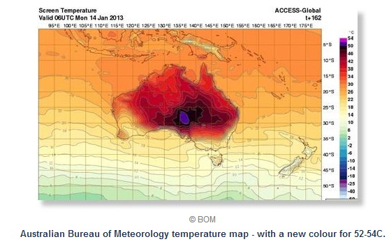
     Satellites reveal sudden Greenland ice melt

     Melt ponds cause the Arctic sea ice to melt more rapidly

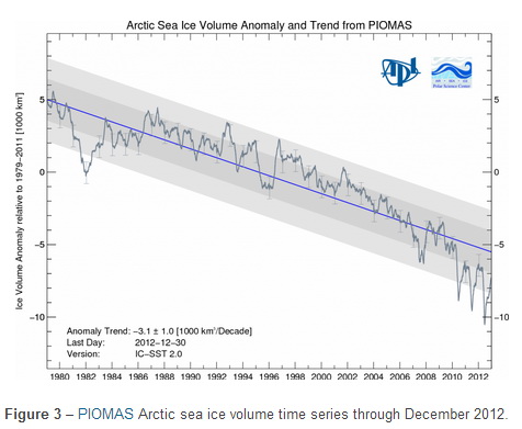
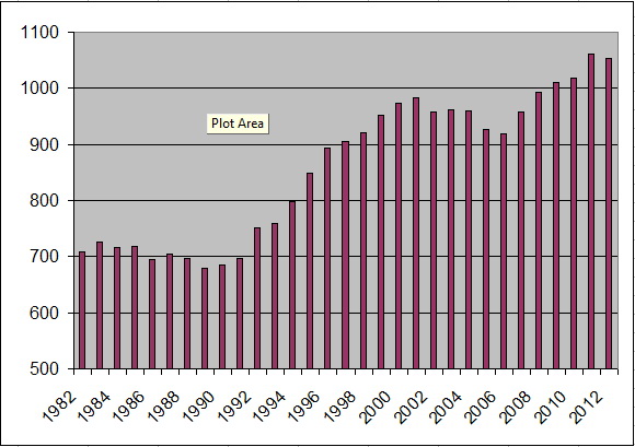
And charts like this that show the longer term trend for Arctic sea ice (source):

ArcticSeaIceTrend

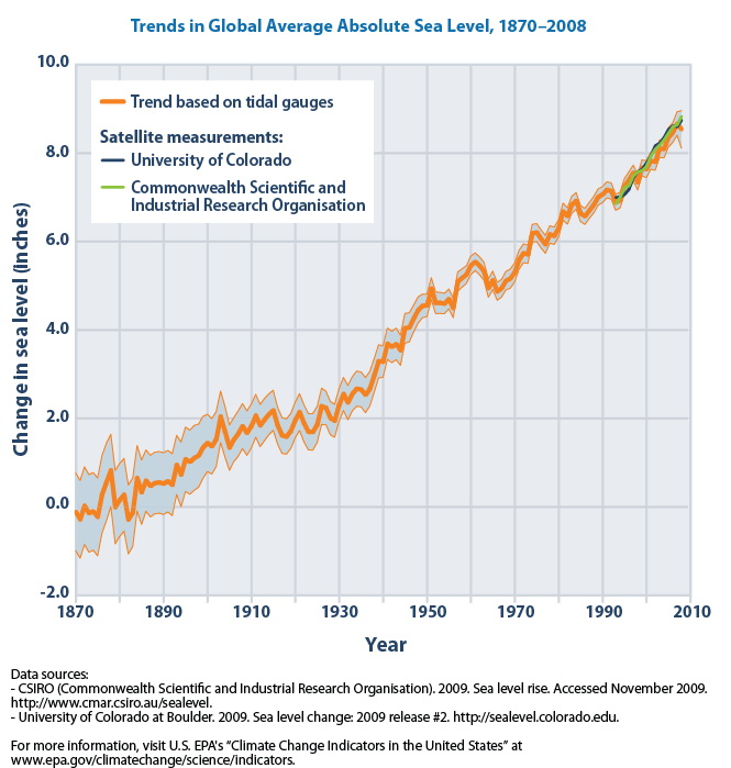
and of course the chart of sea level rise itself:

GlobalSeaLevelTrend

Claims and counter-claims aside, there are, undeniably, people losing their homes to rising sea levels:

     Papua New Guinea: Carteret Islands: ‘The sea is killing our island paradise’

The people of the Carterets, for 300 years ignored by all but a few passers-by, can lay claim to a dubious distinction: within the next six months, some 240 of them – 40 families – will leave for good, driven from their homes by sea-level rise. In five years, half of the population, estimated at 2,500 people, is expected to have been evacuated to bigger, less vulnerable islands, some of the first refugees displaced as a result of man-made global warming. Some believe the islands will be uninhabitable by 2015.

     The view from beneath the waves: climate change in the Solomon Islands

The smaller outer islands in the Solomon Islands are already seeing devastating impacts of the rising sea level. The impact of climate change is already affecting the rural population of Solomon Islands, an archipelago of eight bigger islands and hundreds of small, mostly uninhabited islands…Taro, the staple root crop in Ontong Java atoll, is dying due to salinity of the swamp and sandy soil. And graves at the Tuo village cemetery, an island in the eastern Solomons have been exposed by eroding waves.

During the 1980s the burial place was about 50m away from the beach. Today the beach is about 1m with only one cross remaining as the rising sea had washed most away.

     Vanishing point

Unless Tuvaluans adopt the lifestyle of the Marsh Arabs and build their houses on stilts over water, and that’s where they live 24 hours a day, eventually most, if not all, of the island will become uninhabitable.

     Micronesia: A Third Kind of Nation, Written Off?

“Even the dead are no longer safe in my country,” Micronesia’s Ambassador to the UN told ABC News at his mission’s offices on a rainy day in New York.

He gave us recent digital photos of his home islands.

In one, a man stands shin-deep out in a calm and sunny sea … where a cemetery used to be.

In others, colorful traditional burial grounds spill out of a wave-eroded bank onto the tiny remaining beach, and water surges inland past tumbled houses.

     Sea change: the Bay of Bengal’s vanishing islands

     Paradise lost?

The tiny Pacific island nation of Palau is a paradise on earth. This band of several hundred islands is home to some of the world’s most stunning marine life, and to the twenty thousand people who live there.

But like many low-lying nations across the world, Palau is threatened by the effects of climate change and sea-level rise.

Palau’s coasts are being eroded, its local farmlands tainted by seawater, and its valuable reefs threatened. Johnson Toribiong, President of Palau, calls the damage he’s witnessing “a slow-moving tsunami.”

Kiribati, the Maldives, Torres Strait Islands, Cook Islands, many small islands of the Philippines, and the inhabited areas Barbados–all are getting inundated.

And it isn’t just the small islands that are having trouble. Large cities like Jakarta are facing dual difficulties: sinking land from the draining of freshwater aquifers combined with rising sea levels (source):

Experts in Indonesia are preparing to build a huge wall to stop the ocean from swamping parts of Jakarta.

Some suburbs in the capital already go underwater when there is a big tide but the problem is expected to get even worse.

Jakarta is sinking by up to 10 centimetres a year and Indonesia’s national disaster centre says with oceans rising, large parts of the city, including the airport, will be inundated by 2030.

Flooding and high tides are already causing problems for some residents in the city of 10 million people.

New York is still suffering the effects of the elevated storm surge from Superstorm Sandy.

London completed the Thames Barrier in the early 1980s to deal with rising tides boosted by increasingly powerful storms. They raise the barrier in the Thames when rising ocean waters threaten to flood London and the Thames Valley. In the 1980s, they raised the barrier 4 times; in the 1990s, 35 times; and from 2000 through 2010, 80 times.

And according to Scientific American, Shanghai, which means “above the sea” is finding itself on its way to being below the sea. The city has spent billions of dollars fending off the encroachment of the sea:

But the city’s biggest concern remains the slow, steadily mounting threat that comes from sea level rise. Higher tides are washing away the precious delta soil upon which the city’s foundations are built, and water supplies are becoming more tainted as seawater intrudes more deeply into the fresh water of the Yangtze.

Species Extinction

It seems that major changes in conditions on the planet give rise to the extinction of a large number of species. This has happened five times in the last several hundred million years. The most recent such event saw the demise of the dinosaurs. Some observers—such as the US Geological Survey for the chart below—offer data that points to the idea that we are in the middle of the sixth such mass species extinction event:

SpeciesExtinction

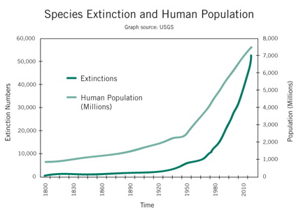
This indicates that the changes we are experiencing are way beyond trivial.

Here is Part 4.

What is the Transition? Part 2

An Important Weather SHIFT

This is not a contribution to the raging global warming debate in which some people who pretend to be civilized threaten those who disagree with them with torture and death.

And it’s about a weather trend, not what happened last week in one place.

This is about a global weather shift. And if this shift is correctly described below, then it has major consequences. But almost no one is talking about it.

In their local areas, this shift has been apparent to North American gardeners for years, as they have been increasingly able to grow plants farther north than previously possible. The first map below is the USDA (US Dept. of Agriculture) Plant Hardiness Zone map published in 1990. It told gardeners what plants would survive in their geographical zone, but gardeners learned to “cheat” the zones in recent years, growing plants rated for one zone south of their garden. The second map below was a revised zone map published by the Arbor Day Foundation in 2006 because they knew the USDA 1990 map was seriously out of date (the maps are from Mother Jones):

USDA1990ArborDay2006Notice how Zones 3 and 4, for example, shifted north, in some places by hundreds of miles, indicating warmer temperatures farther north.

In 2012, the USDA published their own new zone map and admitted that the “new map is generally one 5-degree Fahrenheit half-zone warmer than the previous map throughout much of the United States.” So they admitted that the lowest temperature to be expected in many areas was five degrees F greater in 2012 than it was in 1990!

That same warming trend was bringing heat and drought farther north each year. For a decade, Northern Mexico has been struggling with heat and drought. In 2010 and 2011, this condition moved into Texas with a vengeance, bringing scorching heat and a lot of wildfires. In 2011, the wildfires spread to New Mexico and Arizona, with Colorado often experiencing smoke from these fires. In 2012, winter temperatures averaged six to seven degrees F above normal in Colorado, and by Spring, the fires arrived en masse in Colorado and Utah, and by Summer, even into Wyoming and Montana:

     Colorado farmers are facing disaster

During the Summer, more than 60% of the counties of the lower 48 states of the US were declared drought disaster areas.  And this Winter has been far milder than normal in most of the US:

     U.S. Agriculture Secretary: 2013 already a drought disaster

America’s first official disaster areas of 2013 were designated because 597 counties have experienced severe drought conditions for eight consecutive weeks, according to the U.S. Drought Monitor.

Last year, 2,245 counties in 39 states were declared disasters by the USDA. With continued drought projected for much of the United States, farmers may have another hard year ahead of them.

     2 Great Lakes hit lowest water level on record

…the lakes…declined 17 inches since January 2012.

     Chicago expected to tie record for lack of snow

Chicago’s mild winter reaches another milestone on Tuesday: 319 days without an inch of snow falling.

That ties the record set in 1940. Wednesday will break the record and, with temperatures forecast to surge into the 50s Friday and Saturday, the record streak will continue.

     Low water may halt Mississippi River transport next week

And a good summary:

     2012 was hottest year on record for Lower 48 states

The average temperature was 3.3 degrees higher than in the 20th century…

Last year was the hottest year on record for the contiguous 48 states, marked by near-record numbers of extreme weather events such as drought, wildfire, tornadoes and storms, according to the National Oceanic and Atmospheric Administration.

And surface temperatures in the Arctic have been rising for years. Here is the longer-term chart:

arctice-north-latitudes-surface-temp-trend-annual-thru2011

While the US heats up, Canada’s winters become more mild, and the surface temperature rises in the Arctic, there have been increasingly fierce and deadly winters over the last few years on the other side of the North Pole, especially in eastern Europe. From 2012:

     Europe death toll rises in big freeze

     Blizzards hit eastern Europe hard

And from 2013:

     Pyrenees ski resorts top world snow charts with over 7 meters (23 feet) of snowfall in one month

     Heaviest snowfall in many years hits Polish-Slovakian border

     Snowiest winter in 100 years paralyzes Moscow

     New satellite image shows the unusually frigid and snowy conditions that blanketed much of Great Britain

     Heavy snowfall closes dozens of roads in Turkey

     Record snowfall closes lifts and roads in the Pyrenees

     Snowpocalypse Russia: ‘Snow tsunami’ swallows streets, cars, buildings

     Europe hit by blizzards, air traffic havoc, deaths

     Croatia snowfall shatters record set in 1861

     Snow blankets parts of Middle East, Jerusalem

     ‘Lowest temperaure in Bangladesh’s history’ brings at least 80 deaths

     Unprecedented cold spell breaks 50-year records in Pakistan

     Heavy snow, torrential rain, gale-force winds batter Greece

     Russian Trans-Caucasian highway closed due to heavy snowfall

     China’s extreme cold snaps records

     More than 100 dead as cold snap hits India

     Record cold snap grips Korean Peninsula

     Coldest winter in decades for Russia with snow as much as 5 meters (16½ ft) deep – Plows cannot reach roads to clear them

And I can go back to 2012 headlines and find a lot more of the same, though, as usual (as always???), the trend accelerated in 2013.

Admittedly, claiming trend changes for weather is a dicey business. Weather has a knack for frustrating those who declare trends. But there is strong evidence for a rather persistent procession of heat marching north toward the geographic North Pole in the Western Hemisphere and cold moving south from the Pole in the Eastern Hemisphere.

So, if that’s right, what could be the cause?

Well, there’s another well-known phenomenon making a similar directional march. Here are some graphics from ModernSurvivalBlog.com that track the movement of the magnetic North Pole, with the data supplied by conventional scientific organizations such as NOAA. Here is an animated gif of the movement over the last 400 years:

magneitic-north-pole-shift-400-years (1)

And here’s the last 150 years:

magneitic-north-pole-shift-50-year-periods-last-150-years

And over the last 50 years:
magnetic-north-pole-is-heading-to-russia

From the creator of these graphics:

Since 1860, the magnetic pole shift has more than doubled every 50 years…During the past 10 years, the magnetic north pole has shifted nearly half of the total distance of the past 50 years!

Here’s another way to look at the accelerated movement:

MagneticPoleShiftHistory

Where is the pole heading? In the direction of Siberia. All this is not woo-woo information, airports that paint magnetic compass readings on their runways are having to repaint those number every several years.

What’s happening is that, depending on where you are, a compass reading can change by one degree every five years.

The magnetic South Pole is doing the same type of movement away from the geographic South Pole, having moved off the land mass of Antarctica years ago.

Most simplified graphics of the Earth’s magnetic field look something like this:

Earth_geomag

So the question is: Is weather moving with the movement of the magnetic poles? Another way to frame the question: At the magnetic poles, the Earth’s magnetic field captures charged particles flowing from the Sun on the solar wind and directs them toward the surface, an effect visible in the extreme northern and southern latitudes as the Aurora Borealis and Aurora Australis. Is the same energetic pattern also delivering the coldness of space to the planet’s surface? Or is it the relative thinness of the magnetosphere at the magnetic poles?

Well, if it’s correct that this coldness is moving with the magnetic poles, why should anyone care? Because if substantial coldness is moving away from the traditional locations of the geographic poles in Arctic and the Antarctic, then it would seem that the ice at the geographic poles would melt far more quickly than most would expect before equivalent new formations of ice could develop, particularly in the South Pacific where there is no landmass nearby. Perhaps I am uninformed, but I have not heard that such an effect is being accounted for in anyone’s climate change model. And as shown at the beginning of this post, the movement of heat north through North America from the south is proceeding rapidly. If this continues, or more likely accelerates, there might be a whole lot more melting of polar ice caps than previously expected, raising sea levels faster than almost anyone anticipates.

And perhaps my effort above was feeble, but there is a lot of evidence out there for this weather shift. So why are so few talking about it? Clearly, because it doesn’t fit people’s models of how things work. Magnetic pole movement is straight out of conventional science, while the idea that it would impact the weather is not. The solution for most? Ignore the evidence.

What is the Transition? Part 3 is here.

What is the Transition? Part 1

I have made reference to “the Transition.” Before trying to describe its essence, it will be useful to first review aspects of the Transition, in other words, some of its identifiable characteristics. One aspect that runs through all of the others is acceleration, as you will see.

EARTH CHANGES

EARTHQUAKES

Below is a chart of how much shaking the planet has experienced from strong earthquakes for the last 30 years. This chart sums up the Richter values for all earthquakes of magnitude 6.0 or greater for each year. The earthquakes are summed rather than simply counted so that larger earthquakes have slightly greater weight on the chart. To show the trend, the column for each year shows the 10-year average of all that shaking. The trend is unmistakable—things started to really scale up in the early 1990’s:

EarthquakeTrend

The data for this chart was assembled from a straightforward query of the USGS (US Geological Survey) database at their Global Earthquake Search page.

After the massive Japan earthquake and aftershocks of 2011 (it is worth watching this video graphical display of the world’s 2011 earthquakes, especially if you live in the Ring of Fire), there were fewer earthquakes in 2012. However, 2013 is off to a very fast start, as shown in part in this link from Feb 2:

Earth reeling from eight major earthquakes striking in 5 days

And since that post on Feb 2, there have been an 8.0, a 7.0, a 6.4, and a 6.3 in the Solomon Islands, a 6.9 in Japan, and a 6.9 in Columbia.

TSUNAMIS

Earth doesn’t typically see a lot of large tsunamis, but their occurrence has ramped up fivefold in recent years. According to data at the NOAA Global Historical Tsunami Database, which has records going back to 2000 BC, there have been 34 tsunamis with a wave height greater than twenty feet over the last 400 years. Six of those, or 18%, have occurred since the year 2000:

Year Location Water Height Deaths
2000 GREENLAND 50.0
2004 INDONESIA 50.9   226,898
2006 INDONESIA 20.9         802
2009 SAMOA 22.4         192
2010 CHILE 29.0         156
2011 JAPAN 38.9    15,854

In the Twentieth Century, there was a tsunami with a twenty foot wave height about once every ten years. In this century, it has happened once every two years, resulting in the deaths of a quarter million people despite the fact that none of these tsunamis struck a major city. The NOAA’s database shows that even a tsunami less than five feet in height can kill thousands. With 23% of the world’s people living in what is called the “near coastal zone,” tsunamis are likely the single most life-threatening Earth-change phenomenon on the planet.

VOLCANISM

Due to the great behavioral variations of active volcanoes, the tracking of volcanism is not as mathematically rigorous as that for earthquakes and tsunamis. There is a site jointly sponsored by the Smithsonian and the USGS that reports on volcanic activity in the latest week. Here is their list for the week of 30 January–5 February 2013:

New Activity/Unrest:

  • Colima, México
  • Etna, Sicily (Italy)
  • Paluweh, Lesser Sunda Islands (Indonesia)
  • Rabaul, New Britain
  • Reventador, Ecuador
  • White Island, New Zealand

Ongoing Activity:

  • Batu Tara, Komba Island (Indonesia)
  • Chirpoi, Kuril Islands (Russia)
  • Copahue, Central Chile-Argentina border
  • Karymsky, Eastern Kamchatka (Russia)
  • Kilauea, Hawaii (USA)
  • Kizimen, Eastern Kamchatka (Russia)
  • Lokon-Empung, Sulawesi
  • Sakura-jima, Kyushu
  • Santa María, Guatemala
  • Shiveluch, Central Kamchatka (Russia)
  • Tolbachik, Central Kamchatka (Russia)

So, their list is all from the Pacific Rim and Italy. According to some who track this carefully, after a total of 77 volcanic eruptive events for all of the year 2012, there were 44 volcanic eruptive events recorded just in the month of January 2013.

Here are some volcano-related headlines shown on the SOTT.NET Earth Changes page in just the last couple of weeks:

The Great Awakening? Ten volcanoes awaken in one week

Indonesia’s Mount Lokon volcano shaken by double eruptions

Puyehue-Cordon Caulle volcano erupts in Chile

Tavurvur volcano erupts in Papua New Guinea, ash cloud diverts flights

Hawaii’s Mount Kilauea lava lake hits new record high

Manam volcano (Papua New Guinea): Large explosive eruption sending ash plume to 45,000 ft altitude

Campi Flegrei supervolcano raising anxiety among Italian residents

WEATHER EXTREMES (Storms, Floods, Heat Waves, etc.)

Does anyone on the planet need to be told that storms are ramping up in size, intensity, and frequency, resulting in unprecedented flooding? And that heat waves have taken on new intensities and duration? Is there anyone still claiming, “It’s just the internet, nothing has changed, we just have better reporting.”? Anyone making such claims would be well-advised to review the recent history of the global insurance industry. The venerable Lloyd’s of London almost went bankrupt in the mid-1990’s after 350 years of annual profits. They said they had to completely revamp their weather catastrophe calculations because the actuarial data on which they had relied for 300 years (!) was no longer applicable.

Below are some quotes from September 2010 on the web site of Munich Reinsurance, the largest re-insurance company in the world.  Reinsurers sell insurance to other insurance companies to cover catastrophic losses:

Munich Re’s natural catastrophe database, the most comprehensive of its kind in the world, shows a marked increase in the number of weather-related events. For instance, globally there has been a more than threefold increase in loss-related floods since 1980 and more than double the number of windstorm natural catastrophes…

Prof. Peter Höppe, Head of Munich Re’s Geo Risks Research/Corporate Climate Centre: “It’s as if the weather machine had changed up a gear.”

Heavy rain and flash floods are affecting not only people living close to rivers but also those who live well away from traditionally flood-prone areas.

And then things accelerated further. By October 2012, Munich Re reported that the numbers were even larger. They reported that weather-related loss events in North America had grown fivefold over the past three decades, and that there was “an increase factor of 4 in Asia, 2.5 in Africa, 2 in Europe, and 1.5 in South America.”

There are literally thousands of headlines available to demonstrate this idea further, here are just a few:

Cyclone frequency in Indonesia increases 28-fold since 2002

Global warming – or something much worse? Australia adds new colour to temperature maps

The temperature forecast for next Monday by Australia’s Bureau of Meteorology is so unprecedented – over 52C – that it has had to add a new colour to the top of its scale, a suitably incandescent purple.

Aus_New_Color

Tornado slams into Italian steel plant – video

To give you an idea how rare tornadoes are in Italy, four tornadoes in total were recorded in the 17th, 18th and 19th centuries, three were recorded in the 20th century and four were recorded since 2008 alone, with two of those coming in 2012.

And the damage is not limited to single instances, it is cumulative in many areas, for example, the US East Coast:

Former USGS scientist: Coastal cities are ‘sitting ducks’ for next big storm

“We have left our coasts sitting ducks, and Sandy destroyed these natural protections,” she said.

In the space of a few hours, Sandy blew through the sand dunes that had served as natural protections for communities up and down the Atlantic coast.

“Basically these dunes build up over geologic time, and yet the superstorm wore them down over a couple of days, and it is going to take geologic time again to build them back up,” McNutt said.

For those who are more video oriented, this youtube poster does a good job of grabbing news video of weather extremes and earth changes from around the world each month. These can be useful to watch since they can remind just how quickly, under the tremendous distraction of daily life, we forget what’s been happening:

Extreme Weather Events and Earth Changes DECEMBER 2012

The November installment includes Superstorm Sandy. Since the news media typically won’t cover a weather story unless there is a body count to report, few are aware that Lower Manhattan in New York City is still seriously impaired, with skyscrapers running from emergency generators on the street because their basements are still flooded.

RISING TIDES – WITH PERPLEXITY THE SEA AND WAVES ROARING NOVEMBER 2012

FIRE AND ICE – EXTREME WEATHER EVENTS AND EARTH CHANGES JANUARY 2013

(While I applaud SOTT.NET and the maker of the youtubes above, fidockave213, for their excellent work at collecting earth change information, I am not aligned with their editorial views.)

Part 2 describes a huge weather shift taking place on the planet that almost no one is talking about!

Cliff Posers, and the Incredible Shrinking US Pie

If the politicians in Washington DC didn’t bring suffering to so many people, their posing with respect to this “fiscal cliff” would be laughable.

First, none of them intends to do anything substantive about the biggest problem of all: the Trillion Dollars the US spends each year on its war machine to maintain its rapidly fading pretense that Earth is part of the US Empire.

Second, none of them are including in their fake calculations the five additional bailouts that they all know are either already in play or right on the doorstep. The four new ones:

  • US Postal Service—losing $ billions every quarter
  • FHA—after “quasi-government” housing stimulus and campaign-finance corporations Fannie Mae and Freddie Mac went bust because they had enabled millions of insane mortgages, the FHA took over their role and rose from relative obscurity to be the new Federal backer extraordinaire of insane mortgages. As predicted by honest observers, it now needs a bailout.
  • PBGC—the Pension Benefit Guarantee Corp is now operating in the red.
  • Student Loans—with the default rate now going exponential, everyone involved in this $ Trillion market will need a bailout. Check the trend on this chart of the 90-day default rate:

StudentLoanDefaultRate

The government headline admits that 11% of these loans are in default, but a reading of the fine print says it’s closer to 22%. That’s 22% of a $ Trillion in loans.

And the bailout that is already well underway:

Social Security—What? Some politicians claim the SSA is good through 2033. Strange claim, given that SSA will run $162 billion in the red for 2012. Well, they say it’s “only” a $47 billion deficit because there was a special payment from the Treasury of $115 billion to offset the “temporary” payroll tax cut. And if you think this year is some exception, the deficit for 2011, before the payroll tax cut, was $46 billion. One of the largest problems for Social Security is this: as cash was paid into the program into what was supposed to be the Social Security Trust Fund, the government spent that money and put IOU’s in the Trust Fund. Well, given the ultra-low interest rates paid on government IOU’s due to the low interest rate regimes run by Greenspan and Bernanke, the Trust Fund is earning at least $700 billion less in interest over the next 10 years than they thought they would be earning. So that thing about SSA being OK though 2033? Oops. For a look at the unhappy calculations, see this.

So how did this happen?

Here is a huge contributor: As reported by the World Bank, government statistics collected from around the world—and pretty much everyone agrees that government stats are just a bit biased to the upside—say that the global economy grew by a total of 9% from 2001 through 2011. By those same stats, in 2001, the US economy was 32% of the total world economy. By 2011, the US economy was just 22% of the world economy. That’s a huge 32% reduction in global market share for the US. These calcs are here.

So the question is: How does a country have its economy shrink by 32% in terms of its share of the world economic pie and yet keep spending a $ trillion a year on war and keep all of its benefit programs and government agencies intact? Doesn’t this lead to some type of breaking point? Normally, yes. But so far, the solution has been simple: the country borrows the money. In 2001, the US owed $6 Trillion. Now it owes over $16 Trillion. But won’t people stop lending to such a country? Yes, but the Federal Reserve prints up new money and buys the excess new debt authorized by Congress and issued by the US Treasury. For the next three years, the Fed admits to planning to buy virtually all of it. See Treasury Scarcity to Grow as Fed Buys 90% of New Bonds. Simple? Yes. Sustainable? Not in the recorded history of this planet.

So when you hear the cliff posers from both parties trying to score political points, remember that what they aren’t talking about is far larger than what they are talking about. And that what they aren’t talking will have a far bigger impact on all of us.

Perfect

There is a realm of life that is … perfect.

It can be touched. It can be contacted.

Every person can do it, even if only for a moment. It is one of our birthrights.

It can happen on purpose. In meditation. That’s the most reliable way, and the safest. Or it can happen “by accident,” laying in a grassy field opening to comprehend the manifested vastness of all those suns and galaxies. For some, it happened “by accident” when they tried psychedelics.

Some recall the experience. And wish they could have it again. They can. If they recall it. And touch it again.

Others remember it. And deny it! Claim it was meaningless: A return to a delusional narcissistic paradise.

And yet it is there. Perfect. A pearl beyond price. There for the seeking.

Worth pursuing. Worth contemplating.

Found, it brings change. Even some things on the physical plane might seem, well, perfect. You might hear nearly-involuntary exclamations from yourself: “Perfect!”

And perfect might even be useful. And it might even cause trouble. What? Perfect causes trouble? Strange stuff that. A topic for another day.

And if anyone is darkening their field with this type of idea, “Yeah, I tried that years ago, it didn’t work for me”: Well, you know this acceleration thing we keep talking about? It’s happening on all levels. If you had inner aims that have become a little rusty, you might want to fire up those aims for another try, you might be very pleased with how much more accessible–how much more available–results, unexpected results, have become. The “boundaries” that seem to separate the planes of existence are thinning. It is an aspect of this transition.

As the magnificent Serapis Bey says, “Seek, seek, seek, seek. And when you are tired, take your rest. And when you are rested, seek, seek, seek, seek.” A prediction from a prediction-tracking addict: You will be amazed at what you find. Perhaps it will be “your own true nature, which is tireless, ever seeking, ever finding.”

Gold Goes Mainstream

Gross: Stock and bond managers today must be alchemists: turn lead into gold. NOT likely. Too much lead (bubbled assets).
–Tweet from Bill Gross, Founder of PIMCO, which manages $1.8 trillion

**************

“Do you own gold?” “Oh yeah. I do…There’s no sensible reason not to have some.”
–Ray Dalio to the Council on Foreign Relations

This is being written to put the precious metals market in a larger context for those people who still see the world proceeding much as it has proceeded in the past, a world without the large financial and supply chain disruptions that we foresee.

Strong multi-year upmoves in the price of any asset, aka a secular bull market in that asset, go through three stages:

  1. The speculative, early-proponent phase during which the mainstream investment community ignores or derides the potential of that asset.
  2. The mainstream phase, where the mainstream decides that exposure to that asset is a good idea for just about everyone.
  3. The mania phase, where just about everyone feels that they must own that asset and will tell you so when you meet them by chance in the supermarket.

Phase 1 for gold has been marked by derision from the mainstream investment community. Quoting Keynes, they call gold the “barbarous relic.” Otherwise-intelligent economic commentators such as Nouriel Roubini have been calling for a price top in gold for several years. Some who are old enough to have experienced the gold bull market of the 1970s have been saying, “We heard all this before in the 1970s, anyone who buys gold now will regret it later.” All of these people have been wrong all along as gold and silver have powered higher in price.

During most of Phase 1, the major central banks of the world have been sellers of gold, preferring to buy government bonds of various countries (such as Greece and Spain!) to “get a return” on their money. Gold has been a far better investment for the last 12 years. Over the last three years, central banks have become net buyers of gold, to the tune of hundreds of tons per year. Most but not all of this buying has come from Asia as the western central banks have been preoccupied with printing money in a mad scramble to keep their markets afloat.

Gold has been in Phase 1 since 2001. Most in the financial community regard it as an annoyance when their clients ask about it. The price increased from $256 in 2001 to $1,911 in August, 2011.

A couple of weeks ago, Ray Dalio gave a presentation to the CFR. He was asked if he owned gold, and he said, “Oh yeah. I do.” This marked the start of Phase 2, the mainstream phase.

Who is Ray Dalio? Most people in the investment community respect him as the best active hedge fund manager on the planet. We mentioned his firm, Bridgewater Associates, in a previous post. They manage about $140 billion. Ray is highly respected in both financial and political circles.

And the CFR is the Council on Foreign Relations. If you had to pick one organization that has the most influence on the mainstream political thought in the US, it would have to be the CFR. It was founded by the Rockefellers. You have to apply for membership. There are currently 4,700 members, including Bill Clinton, Robert Zoellick, Janet Yellen, Paul Wolfowitz, Lloyd Blankfein, Jamie Dimon…in other words, the CFR is the public face of The Powers That Be/Were.

Now that all of these mainstream movers and shakers have heard from what some consider the smartest money man on the planet that owning gold is a good idea, well, if we haven’t yet convinced you to get rid of a mainstream financial advisor such as a broker, said broker is likely to be calling you in the not-too-distant future with their “innovative” idea that you should get some gold. Of course, being mainstream, they will likely advise you to own it in paper rather than physical form, which will be a big mistake, but that will be their advice. And they will advise that you put a maximum of 5% of your assets into gold or gold mining stocks. In normal times, this would characterize the mainstream phase for gold, during which its price would rise steadily for years.

More evidence that we’ve entered the mainstream phase comes from Bill Gross, known to many as the “Bond King.” Gross founded PIMCO, which manages over $1.8 trillion. Yes, that’s trillion with a T. Almost all of the money is in conservative bond funds. But here’s a tweet this week from Gross:

Gross: Stock and bond managers today must be alchemists: turn lead into gold. NOT likely. Too much lead (bubbled assets).

Note that Gross, the Bond King, is saying that stocks and bonds are bubble markets. That money managers should turn that lead into gold. Though he also says that’s not likely.
Those who hate gold claim gold is in a bubble. Great examples of bubble markets are internet stocks in 1998 through early 2000; or real estate running up to 2006; or government bonds now. Gold, on the other hand, has had a nice steady rise for years, nothing meteoric or bubble-like at all. And here is someone, Bill Gross, who may know more about bonds than anyone on the planet, saying that bonds and stocks are the bubble, not gold.

Gold can’t possibly enter a bubble until it enters Phase 3, the mania phase. During this phase, you will be regaled on a regular basis from media sources and individuals with stories of people who got rich from gold and silver. Like the stock day traders of the year 2000, or the real estate flippers of 2006, there will be lots people trading gold on a daily basis, probably at gold trading shops like the day trading shops that were operating in 1999. People will be quitting their jobs to trade precious metals to “make their fortune.” 90% of people who talk about gold will assure you that it is the surest thing on earth to guaranteed riches. CEOs of gold mining companies will be like rock stars, getting interviewed by Charlie Rose. That’s what a bubble looks like. How many people do you know who own gold and silver?

Now, with the acceleration that is all around us, it is unlikely that we will proceed through these three phases of a secular bull market as we would in normal times. It is far more likely that gold will have a meteoric rise quite soon. But if you think that the world will proceed in a conventional manner in the years to come, we have outlined the path of the precious metals for you.

Beware the False Flag Attack

Cruisers, aircraft carriers and minesweepers from 25 nations are converging on the strategically important Strait of Hormuz in an unprecedented show of force as Israel and Iran move towards the brink of war.
The Telegraph

What do Daniel Ellsberg, Zbigniew Brzezinski, former high-level CIA officers Robert David Steele and Michael Scheuer, Seymour Hersh, and the Brookings Institution have in common? All have warned of the possibility of a false flag attack staged by the US and/or Israel to make it look like Iran has attacked and killed US citizens. This is covered in its usual excellent way by Washington’s Blog: “What I Fear The Most Is a False Flag – Something Happening Where One of Our Ships Goes Down, Or … a Plane Goes Down, And of Course It HAD To Be The Iranians, You Know, For Sure, For Certain”

A false flag attack is a war operation carried out by a government against its own people but appearing to be carried out by another group or nation; or an attack about which a government knows in advance but which it allows to freely proceed to demonstrate the evil nature of an enemy it wishes to attack.  The World Trade Center attack on 9/11 and the Japanese attack on Pearl Harbor are excellent examples of false flag attacks.  If there is anyone still left on the planet who thinks 9/11 was what the US government says it was, please see the following documentary aired recently on PBS: 9/11: Explosive Evidence — Experts Speak Out.

As the US marks its eleventh year of war in Afghanistan, where 2,000 US soldiers and far greater numbers of Afghanis and Pakistanis have died, many as “collateral damage” from unmanned drone attacks, we think it appropriate to sound the warning because we are convinced that the Powers That Be are aiming to ramp up war to a much greater level.

Why do we think that a large false flag attack is on the way?

To gain public support, large increases in war-making are typically preceded by a false flag attack that is devastating enough to be an emotional shock for in the citizenry. The shock makes people sitting ducks for war propaganda against the alleged perpetrators. People are confused by the shock and are then told precisely where to channel their rage, fear, dismay, etc.

Governments faced with insoluble financial predicaments often try big war as a way out. And many governments, including that of the USA, are in precisely such a predicament.

People and governments around the world are clearly on tenterhooks as shown by recent rioting in many countries, acrimonious borders disputes between Turkey and Syria, China and Japan, etc.

In a few days, the US will have three aircraft carrier groups in the waters off Iran.

And the war propaganda machine is in high gear, in both blatant and subtle ways. Here is a perfect example of the war propaganda machine in its more subtle form. This was the lead story on the front page in a recent USA Today: Defense cuts starting to pinch economy.

First, the idea that war helps the economy, propaganda that most of us were fed in school and which fallacy is still perpetuated by economists such as Paul Krugman, has been debunked by many. Washington’s Blog has covered this topic in great detail: Proof that War Is Bad for the Economy.

Second, while the US Department of Defense (DoD) and its military contractors claim defense spending is falling, others see it, well, otherwise.  Here’s the chart of US defense spending from wikipedia, not including black ops for which no budgets are published:

The bottom area is the budget for the DoD. Above that are other categories of defense-related expenditures that are not included in the formal DoD budget. Both the formal DoD budget and the combination of all expenditures have been rising strongly in unison, even while we have had a Nobel Peace Prize winning president. Also note that most numbers to the right of the vertical dotted line, numbers for the future, are projected to decline. But wikipedia has some honesty here. If go to detail page for this chart, you’ll see previous versions of this chart from prior years. In each of those previous charts, future expenditures were projected to drop. But they never did. When future becomes present, these expenditures always rise strongly. In other words, there are threats of defense expenditure cutbacks, but since the Clinton years, they have never materialized.

Third, whether or not war is good or bad for the economy is clearly a topic of debate. We think it is horrendous, but others claim it is good. So what USA Today is doing here is taking sides in a debate in what was printed as a Page 1 news story. This article is an editorial disguised as news. As such, it is a lie.

Fourth, how about a little common sense. The article, by linking military spending with the concept of a “good economy,” is telling you that war spending is good for you. Tell it to more than a hundred million people who died in wars in the last 100 years.

Fifth, how about some more common sense. The following countries each have one operational aircraft carrier: Russia, UK, France, India, China, and others. The US has eleven operational carriers and three more under construction. Can it really be “good for an economy” to spend trillions on hardware that is very rarely actually used, which is paraded around the world with an armada of other ships in what is called a “carrier group” devouring incredible amounts of fossil fuels, and which hardware is ultimately scrapped when it is deemed obsolete? Does the US really need eleven carrier groups?

This covers just the tiniest slice of the war propaganda machine. But you get the idea. We ask that whenever you hear a report about war, military spending, the countries that are said to be our enemies, weapons systems, or people who go off and get killed or maimed being characterized as heroes rather than as people who were duped by politicians, that you recall this little post and ask: What is really being said here? What is the real point? Who is the actual enemy?

So, Did You Take Care of Business?

Preparation is everything.
–David Daniels

On June 6, we posted the following quote in What then can we do? Part 1:

Our research says that it would be wise to complete this conversion process by August 2012.

What conversion process? That of converting your paper savings primarily into minted gold and silver bullion coins. When we posted that idea on June 6, the price of gold was $1,621 per ounce. From June 6 through August 20, it meandered between $1,553 and $1,629 per ounce. Then it took off to the upside and now sits at $1,774 as I write. (At the time of posting, the price is $1,766.) If you completed the process by August 20, the dollar value of your metals holdings has increased by 9% to 14% in one to three months. If you did the entire conversion late on the last day of August, the dollar value has increased by “only” 5% in a few of weeks.

The question at the top of this post is directed to those who:

  • had monetary savings in electronic accounts; and
  • who still needed to do this conversion as of June 6.

If you have still not taken care of business in this way, we would really like to hear why. You can easily piece together our e-mail address on the Contact page. Send your reasons. What have we failed to explain with sufficient clarity?

Worthless derivatives are being created by Wall St and High St at the rate of a million dollars per second! Governments have promised citizens far more than can ever be funded. If the big banks told the truth about their financial condition, all of them would be seen as insolvent. And it has been obvious for years that most countries in the world had taken on more debt than they could ever repay, and that their only strategy would be to print money. They are doing so. With extreme prejudice! We are fairly certain that you heard that the US Federal Reserve has promised to print $40 billion per month. Ad infinitum! The week before, the European Central Bank promised to print billions as needed. The Bank of Japan joined them last week in the printing campaign. Each of the things in this paragraph would be enough to dissolve the financial system. Taken together, they are an absolute guarantee.

Your paper savings and your income are being devalued by this massive ceaseless money printing. It is an act of desperation by the central bank minions of the bankster class. Their aim is to preserve the game of the big bankers, to enable those bankers to continue their game of theft from all of us. They do not have your interests in mind. Why continue to let these thieves steal from you?

Chris Martenson of PeakProsperity.com often and elegantly describes how, once people wake up to the true nature of our current societal systems, they change their life in a big way. They can’t help it. And they do not regret the changes they make. They may lose income by leaving jobs they dislike, but they pare expenses more quickly. They might need to physically move to a new area. But they begin to enjoy life more, to find the pursuit of their new aims quite nourishing on many levels.

In these times, we contend that it is not enough to wake up only on the inside or only on the outside. We need to do both. And to live from our insights in both realms.

OK, you may have missed the opportunity to buy cheaper gold and silver through August 20. But the prices of these metals, calculated as they are in paper currencies whose quantities are being increased by the minute, will be much, much higher, and sooner than most think.

Oh, you say you prefer stocks? Here’s a chart of stock values versus gold for the last 15 years:

Two points: First, the chart shows gold outperforming stocks by about 4 to 1 over that period. Does holding stocks look like a great strategy? Second, many feel that stock indexes, calculated as they are in paper currencies that are declining in value, are approaching new all-time highs and they are smart to stick with them. If you are in that camp, here are two charts that might, that should, alarm you. It’s the path of stocks during another of the great money printing experiments in history, the Weimar Republic printing campaign in the 1920’s that resulted in an infamous hyperinflation. During that period, the value of the stock market went up when priced in the local currency that was being printed at will by the central bank. The chart looked like this:

In other words, to local people using the local currency, they felt like their money was increasing in value in stocks. The Zimbabwe stock index chart during the recent Zimbabwe hyperinflation looked even better. Stock index charts always looks like this or better when calculated in the local over-printed currency. But here’s what those Weimar stocks looked like to the rest of the world, a world that was still on the gold standard to some degree at the time:

If you think this bears some resemblance to the first chart above, the chart of US stocks priced in gold, then you are getting the picture. At the end of a hyperinflation, stocks crash mercilessly in real value as the currency loses all value. In other words, those who stay in stocks stand to lose almost all of their purchasing power! They might appear to have a lot of dollars. But those dollars will be very near worthless.

And real estate? As we’ve said before, productive real estate from which you can live independently is a great idea. All other real estate is a very bad bet from a financial point of view. Since the real estate bust began in 2006, as retorts to our advice to sell, we have been hearing: Yes, real estate has gone down, but not in my state. Which was then replaced by: Yes, real estate has gone down, but not in my area. Which has been replaced by: Yes, real estate has gone down, but not in my neighborhood. Here’s the chart of US Real Estate priced in gold going back to 1987:

If you understand this chart, you can see that US real estate is worth about half what it was worth in 1987—when priced in real money, that is, gold.  At the end of the Weimar episode, it is said that you could buy an entire city block of real estate in Berlin for one ounce of gold.  We are rapidly moving along that path. Since the real estate price peak, gold has outperformed real estate by about 6 to 1. And the real estate price collapse is happening while the authorities are madly printing money! If real estate were the inflation hedge that its proponents claim, real estate prices should be soaring. Alas, at least no one is claiming that such prices are soaring. But the proponents misunderstand this real estate “asset class.” Its prices are floating on a sea of debt. Once governments can no longer support that debt, prices will drop like a stone. And residential real estate was never supposed to be an “asset class.” It was supposed to be lived in!

Were the charts above prepared by some wild-eyed blogger? No, the first is from Bloomberg, the second and third were prepared by the premier hedge fund in the world,  manager of well over $100 billion of client money, Bridgewater Associates.  All three charts were cited here on ZeroHedge, which, in our view, is wonderfully wild-eyed. The fourth chart is from PricedInGold.com.

Our June 6 advice about completing metals purchases by August was tactical in nature: we spent years in the land of the trading thieves and one earns a knack for detecting those time-price areas where people can get lower prices. We wanted any reader who had not yet completed their buying campaign to get the benefit of lower prices.

But soon we face something that is likely to be quite different. By the second half of October, events with systemic-level impacts are likely to arise, leading to significantly greater difficulty and/or expense in the acquisition of physical metals. If we had not completed our own buying campaign quite awhile ago, we would be completing it by mid-October.

Again, from our previous posts, here is a summary of what we see coming to your current favorite planet:

  1. Electronic accounts (bank accounts, brokerage accounts, mutual funds, etc.) are found to be empty after the implosion of the derivatives market, so there are no transactions via ATM’s, credit cards, checks, on-line payment systems, etc.
  2. During a transitional period, people and businesses still accept national paper currencies—in hard cash form only, all electronic transactions will not be trusted—while barter, local barter currencies, and minted gold and silver coins become understood and accepted for transactions.
  3. During that transitional period, fewer and fewer accept national paper currencies as they increasingly favor local barter currencies, gold coins, and silver coins.

Here is the most important issue: Will you be helping others during this transition? Will you be operating from a prepared, strong position? Will you be helping to re-start your local economy by spending some silver and gold? Or will you be paralyzed, floundering, panicking, regretting, in need of help, etc. The choice is straightforward.

Preparation is everything.
–David Daniels

A Quick Note on Them

We are creating a detailed future post on Them. You know, The Powers That Be/Were. It will make a strong point that those in the true ruling class on this planet have intelligence and will. And these abilities are well-honed in them. In part because that’s all they have. They are not in the least hampered in their pursuit of power by those abilities that are highly valued by the vast majority of us, namely compassion, wisdom, love, and an allegiance to peace and freedom for all. They simply don’t have these things. That is what’s so tough to understand about them. If you think these statements are incorrect, please read this article:

Poor In India Starve As Politicians Steal $14.5 Billion Of Food

In Praise of Chest Refrigerators

Nearly every household on Earth has a fridge that totally wastes at least 1 kWh of energy a day (365 kWh a year).
— Dr. Tom Chalko, Mt. Best, Australia

Chest Freezer converted to Refrigerator

That’s a big claim by Chalko, but he has proven that it’s true. How?

Using vertical doors in refrigeration devices is an act against the Nature of Cold Air. Understanding and cooperating with Nature rather than acting against it leads to much better efficiency.

Chalko converted a standard chest freezer into a chest refrigerator. He says that if it were connected to the grid, he would pay about $5 per year for the electricity to run that chest fridge. (He powers his fridge from renewables, not from the grid.) We put a Kill-A-Watt  device that easily tracks appliance electricity usage on our standard American upright side-by-side refrigerator freezer, and it costs $600 per year to power that fridge. So $5 versus $600. Gee, tough choice there!

We’ve probably all sensed the cold air spilling from our upright refrigerator onto our feet as we pondered what to eat next with the fridge door wide open. Cold air sinks! Everyone knows it. But upright refrigerators fly in the face of that simple principle.

Plenty of businesses use chest refrigerators and freezers, but it’s rare to see a chest fridge in a residence. Notice that a lot of horizontal refrigerators and freezers in supermarkets don’t even have tops! Why not? Because cold air sinks! Every time we open our “modern” upright refrigerator, the cold air rapidly sinks out of it.

So, we could all go right out and buy chest refrigerators, but there is a problem with that. To buy even a small 5.5 cubic foot chest refrigerator, it costs over a thousand bucks US. Here’s the only one I can find on Amazon, it costs $1,148 as of this writing.  And the big box chain stores don’t even sell chest refrigerators. Our upright standard American refrigerator has about 13 cubic feet of fridge space. The 13 cubic foot chest fridge on Amazon costs $1,743. And we’d still need a freezer as well.

But chest freezers are far less expensive. A 5.5 cubic foot chest freezer costs between $160 and $200. Which is why Chalko converted a chest freezer to a fridge. And why we are running an experiment along similar lines.

We bought the used chest freezer in the picture above for $75 at a local yard sale. It works great as a freezer. The second expense was the little controller (the Love Controllers Digital Temperature Switch model TS-3) velcro’ed to the top of the freezer door in the picture, and a temperature sensor probe (the TS-11) placed inside the freezer and connected to the controller. Together, these cost $60. The controller decides when the fridge turns on its compressor to make things cooler inside. It’s set to keep the temperature at 38.5 degrees F instead of the below-freezing normal operating temperature of a freezer. So the freezer won’t have to work as hard when it needs to be a fridge rather than a freezer. So we spent $135, rather than $1,148 on the chest fridge from Amazon.

Chalko is an electrical engineer in addition to being a renewable energy pioneer and meditation teacher, so he built his own controller to convert that chest freezer into a chest fridge. He’ll sell you one of his controllers through his web site. It’s better than the one I’m using because it uses less energy than the TS-3 controller. But it’s also more expensive and I wanted a less expensive controller for my experiment.

From the initial Kill-A-Watt readings from our “new” chest fridge, it looks like Chalko is correct about strongly reduced power consumption when one has their refrigeration devices working with the laws of nature rather than against them.

Let’s wild guess that there are 500 million upright refrigerators in the world, likely a low estimate. So if Tom is right and each of those wastes one kilowatt per day, that’s 500 BILLION watts of electricity wasted. Every day!! And utility company power plants are rated in millions of watts of output, only the biggest can put out one billion watts in a day. So it sounds like we have hundreds of unneeded power plants? Gee, I wonder who benefits from all this waste. Couldn’t be that the power companies, power plant builders, and the fossil fuel suppliers like things just the way they are. Nah, they wouldn’t pull a caper like that. After all, they’re such nice people who really care about us, and the Earth.

Let’s think just a little more about this: When people install a solar photovoltaic array to get some power from the Sun, they typically buy a 1 kilowatt to 4 kilowatt array for their home. And one of those kilowatts is wasted in most homes on refrigeration!? Mind-boggling.

Anyway, here is a link to Tom Chalko’s site in Australia, this link is his single-page explanation of his chest fridge. And he has a link to a PDF with a full explanation of his controller and his fridge project. And the rest of his site has lots of great energy ideas. We found out about Chalko’s work from the premier renewable energy site in the US, Build-It-Solar.com, created and maintained by the amazing Gary Reysa.

And this experiment has convinced us to convert fully from vertical to horizontal refrigeration devices. We will post on this topic later with real-time results.

And if anyone wants to duplicate our experiment using the TS-3 controller, please find our e-mail on the Contact page and let us know. We can probably save you some time in terms of wiring that device to a freezer.